SWEET!
Nintendo and ESRB symbols look a bit small (proportionally) compared to the rest of the boxart.
But in my opinion, that's impossible to photoshop from the first picture. First you would have to fix if from a parallogram to a rectangle, which would make distortion, and then enlarging it THAT much will cause so much pixelation its not even funny. IMO i think you just took it from a different site, and then stuck a smaller ESRB and Nintendo logo on it.
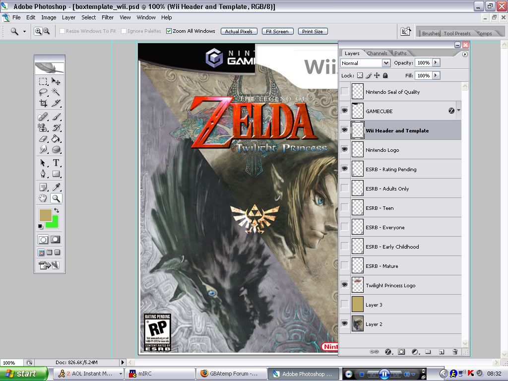
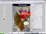
The PSD I got which included the Gamecube Header and the ESRB logos (I did have my own one, but this one was far superior). The Nintendo logo I got from google, which I shrunk down. The Background I took from the currently offline ZeldaPower.com, this was also shrunken down (because the original size dimensions were in the thousands). I grabbed a colour (#bba768), filled a layer with it, applied a colour layer filter @ 90% opacity to make the golden effect you see.
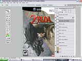
For the Wii header, I drew two lines, one for the left bit and one for the right, aligning them up exactly where they were in the photo. I use a circle to start the slant connecting the two lines, and then used a line tool to finish off the rest of the slant nearer the bottom of the header (seen as just a circle wouldn't suffice). I grabbed a Wii logo off google and slapped it on there, after a bit of transformation to make sure the size matched the one in the photo.
And, well, yeah...that's it :-p
Oh, and here's 3 screenies from the photoshop file, and one extra screenie which I did for a laugh.


Oh, and
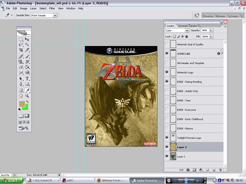
here is the boxart from the joke screenie if you're into that sort of thing...lol.
Sorry if you still think I ripped the box from someone else and tacked on an ESRB and Nintendo logo, but I can't really prove it any other way (unless you think of something).


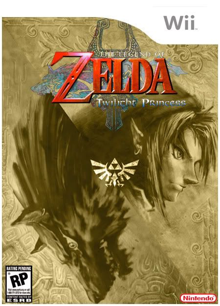
 Totally re-created too, lol.
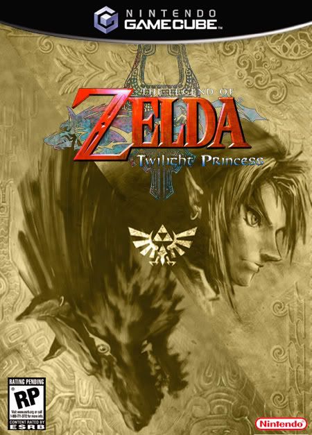