Worst game boxart

FAST6191

Techromancer
Editorial Team
Joined
Nov 21, 2005
Messages
36,798
Trophies
3
XP
28,321
Country
United Kingdom
Again if you disaggre with me then you can show youre contentast for worst game boxart. I post what i think is bad you post what you think is bad. Now if you exuse i am going to check list of 3do games for new contenstants.
Most of the ones I know of have already been taken, moreover it does not really matter when questioning another's picks for it.

I already covered what I reckon goes into bad boxart (pretty much what makes bad art, with the added bonus of in the case of boxart it being intended to convey something about the game so probably ought to do that or at least not actively undermine it or spoil things too badly). If you can avoid too many cliches or tropes and thus have it a bit more memorable then so much the better.

In the case of Burn Cycle it would be described as a race against time before your mind betrays you thanks to an embedded computer virus; you are some kind of spy/data transport... so far so Johnny Mnemonic (even if this predates it) so near future sci fi with an exploration about what makes a mind (and thus human). The three/multiple heads displaying different emotions/aspects of a fractured mind is a bit cliche I guess (second only to looking into a shattered mirror or perhaps patchwork of different photos to make up a whole) but still works. Font is fine as a techno/cyber thriller, especially for that point in time, and the background also serves to convey future. Colours... they could do better and the washed out red on dark/dark blue background might also be a bit cliche for this style of work and 80s sci fi/action sci fi posters but for 1994 I am not complaining much. I already mentioned my misgivings with the background characters, indeed one hasty painting out of them
burn_cycle_tweak.jpg


At this point this almost seems less "worst boxart" and more "haha look at these tropes in boxart" which is great* but don't call it worst boxart if you are not going for that.

*and keep them coming if so -- I might question it as a pick for worst boxart but that is not to say I am not enjoying seeing such things.
 

Nobody_Important4u

Barely real
OP
Banned
Joined
Mar 27, 2019
Messages
364
Trophies
1
Location
No man's land
XP
1,388
Country
Poland
Meh... 3do wasnt too bad anyway i am going to post what i found anyway
Warning: there's a lot of it
pa.28510.1.jpg

220px-3DO_Icebreaker_cover_art.jpg
220px-Ballz.jpg
220px-BattleSport_cover_art.jpg
220px-Corpse_Killer_for_Sega_32X,_Front_Cover.jpg
The_Journeyman_Project_Cover.png
220px-Doctor_Hauzer.jpg
Escape_from_Monster_Manor_Cover.jpg
North_American_Genesis_Fun_'n_Games_front_cover.jpeg
220px-Horde_cover.jpg
Tony_Hawk's_Downhill_Jam_Coverart.png
3DO-Immercenary.jpg
220px-Jammit_Coverart.png
220px-Johnny_Bazookatone_Cover.jpg
mazer.jpg
280full.jpg
220px-Olympic_Soccer.jpg
Olympic_Summer_Games_Coverart.png
PerfectGeneral.jpg
220px-3DO_Plumbers_Don't_Wear_Ties_cover_art.jpg
220px-3DO_PO'ed_cover_art.jpg
220px-Psychic_Detective_cover.png
220px-Quarterback_Attack_Cover.png

I have to make second post to fit all of those lol

--------------------- MERGED ---------------------------

Part 2
220px-3DO_Return_Fire_cover_art.jpg
220px-3DO_Scramble_Cobra_cover_art.jpg
611QQeh52aL.jpg
c912ab585e453cbe474721433323ae85--road-rash-videogames.jpg
Sewer_Shark_Coverart.jpg
220px-3DO_Slam_'N_Jam_'95_cover_art.jpg
220px-3DO_Space_Hulk_-_Vengeance_of_the_Blood_Angels_cover_art.jpg
49935-space-pirates-3do-front-cover.jpg
220px-Twisted_the_Game_Show_Box_Cover.jpg
220px-True_Golf_Classics_-_Waialae_Country_Club_Coverart.png
220px-Way_of_the_Warrior_cover.png
214Bo3ArZgL._AC_UL436_.jpg
220px-Zhadnost_The_People's_Party.jpg

Now that i am done i would like you to vote for the worst one!
Anyway next time on dragon b... I mean worst boxart i will check Saturn boxarts have fun until then!
 

FAST6191

Techromancer
Editorial Team
Joined
Nov 21, 2005
Messages
36,798
Trophies
3
XP
28,321
Country
United Kingdom
Once more I am going to have to question those. Going through them in order

Zhadnost
"Welcome to Zhadnost, the "most popular game on Bizzarnian state run television"! Bizzarnia, a small communist nation has kidnapped contestants for this its favourite game show and is playing them against each other to compete for their freedom."
Seems pretty fitting then.

Winning Post.
They might have only seen the intro video and made that but a bit of stylised art that is clearly about horse racing.

Way of the Warrior.
Assuming that you are not trying to make a comment about how that is a Japanese style sword/dagger and the yin yang is a symbol in various Chinese philosophies I am not sure what needs to be said.

Has a guy playing golf for a golf game... seems OK to me.

Game show game has game show art... while I am always up for more it is hardly bad.

Space Pirates. I am not a fan of photo boxart so much but mean looking guy in a sci fi helmet... seems within reason.

Space Hulk. That is not the best Warhammer 40K art I have ever seen but definitely a 40K space marine there.

Slam Jam. Bit basic but motion blur for action and clearly indicating a basketball game.

Sewer Shark. Not terribly indicative of the gameplay but don't know if I would call it bad.

Road Rash. By this point it had lost some of its humour and charm from the other efforts but it is a game about motorbike racing with some combat options.

Seal of the Pharaoh. I would have probably lost the 4 enemies from the main panel, maybe put the door as a faded out thing in the sky but works.

Scramble Cobra is a bit dark in that scan but the Cobra at the time was well identified as an attack helicopter.

Return Fire. Text work is not great and we can have a debate about the nature of abstract art like that and its suitability here. If you wanted to put the PS1 logo on the 3do artwork then that would be the superior version of both.

Quarterback Attack. That is some aggressively 90s font and text styling but serviceable overall.

Psychic Detective. Colours are fine, the split head thing for psychics and the like I covered last time and one is wearing a pulp detective novel type hat to indicate as such, so maybe a touch cliche but still works.

PO'ed. "It features a cook of a destroyed spaceship marooned on an alien world." offers so many options so yeah that is lazy as you like, and I am not entirely sure what slime has to do with this. So yeah I think we have our first bad one.

Plumbers Don't Wear Ties. A somewhat infamous game but if you wanted to nail that 90s porn VHS look then they have it. By itself though then yeah nothing to write home about.

The Perfect General. What is wrong with that? Tells you what it is about, evokes any number of propaganda posters or war iconography and is generally pretty pleasing to the eye (almost has a bit of golden spiral going on even). If I was making a modernish military strategy game I would be delighted to get back cover art like that.

Olympic Summer games and Olympic Soccer. By the numbers sports game covers and I am not sure about the graphics for the Summer Games one but not a complete turn off either.

Night Trap. You mean the game where you spy on pretty ladies in a house via CCTV (said game also being a full motion video game, which was still a novel concept) and try to protect them from invaders? The game is lacklustre at best and mostly only remembered for the controversy surrounding it at the time but boxart wise I have seen far far worse.

Mazer. Font is a bit hard to read and CGI pretty sub par but at least gives you an idea of what it is about. Not great by any means.

Bazookatone. The game is a mediocre slow platformer with the donkey kong prerendered sprites approach to the world (albeit a bit after they made it notable) and that boxart conveys more speed than that guy ever really moves with but I can't get to bad really.

Jammit. I know some want to go back to edgy sports games and to be fair fifa street probably came as close to not making me fall asleep as a football game has ever got since sensible soccer but it is a street focused basketball game.

Immercenary. That is probably the last time EA would allow their logo to not be front and centre and they probably ought to have kept it hidden as I am sure the owners of Battlestar Gallactica will be on their case. Still if they did not have the "combat in a digital world" line in that it would have been my among my first guesses about the contents of the game.

Tony Hawk's Downhill Jam. In this game you ride skateboards downhill. By no means a good game but boxart wise that does what it has to do.

The Horde. It does prominently feature a king and a squire/esteemed subject, and you are under attack by hungry red monsters. I reckon the title screen for the game would have been better in some ways and I would have no clue as to the mechanics of the game (though action strategy was new at the time), nor does it particularly please my eye but I am having a hard time arriving at bad.

Fun'N'Games. Nightmare fuel really but broadly in keeping with the art style of the game and cartoons of the time.

Escape from Monster Manor. I would have blown up that image to the whole boxart (or nearly so with a black background if necessary) but that with the escape from Monster Manor title tells me most of what I need to know here.

Doctor Hauzer. The swinging blade thing is classic trap iconography, and the gears speak to puzzles and whatnot (better yet they also don't appear to be 3 gears that will lock themselves up if someone tried to turn them which is what I normally see). Another by no means good but speaks to something of a mystery/trap dodging affair with the wormhole thing being a mysterious forces theme as well. I imagine far better could be done but I would also let that go out to the world.

Journeyman Project. Victim of bad, or at least badly aged, CGI. Does not tell me too much about the game really so there is that, and does not make me want to play it. As as complete turn off though I can't get there.

Corpse Killer. Bad? That is great. Game has you dropped on a tropical island to fight zombies and that tells me just that. Another I would be delighted to have for such a game. Font wise Killer is perhaps not the best font choice and Corpse maybe leans too much for old school horror poster but those are both fairly minor things.

Battlesport. Future sports game where you fight in spaceships of a sort in an arena for a sport (think Rocket League but a fraction as good). Saw it in action as part of this and I think i would rather play Speedball, and I really don't like speedball (don't know why, just never clicked for me). Don't know how you are going to work the sport angle into graphics without getting cheesy but it is a game featuring a space ship that looks somewhat like that one depicted. Could be worse.

Ballz. Victim of the extreme naming trends of the time I guess and I will probably have to cover things here as far as history of graphics (short version being 3d balls are easy to render so there was a bit of a fad for making things from them for a while, see also Vectorman, and even traditional 2d made use of it -- megaman,

Icebreaker. Yeah don't need to say too much about that one.

Castlevania Down of Sorrow. Grey label/player's choice/second issue version. Actually took me a second there to realise what you meant. The base boxart twisted to a jaunty angle is the absolute laziest method out there (as in black background times new roman text is less lazy) and the original was nothing special to begin with (character display with main character up front was probably old when the hills were young, that doing less than most here). That said it I would sooner have that on my shelf than a lot of grey label/player's choice/second issue versions I have seen/obtained over the years.

As you frequently seem to want things then one of the games I was thinking of last time for the bad region changes was Knight's Contract.
knights_contract_side_by_side.jpg

Now when comparing US to EU approaches to graphics design then most people will tell you the US goes in for massively oversaturated and if they can stimulate you more visually then they will. This is basically the perfect example in boxart form.
 
  • Like
Reactions: Nobody_Important4u

ThoD

GBATemp Addict (apparently), but more like "bored"
Member
Joined
Sep 8, 2017
Messages
3,631
Trophies
1
Age
27
XP
3,049
Country
Greece
This thread has turned into nightmare fuel to be honest looking at some of these:rofl2:

View attachment 188596
Again art is not bad but someone fucked up
Thanks for posting that, the art isn't bad, but I wanted to play that again, one of the RPGs I've had the most fun with on the PSP and just couldn't remember it's name so I could play it again!
 
  • Like
Reactions: Alexander1970

Nobody_Important4u

Barely real
OP
Banned
Joined
Mar 27, 2019
Messages
364
Trophies
1
Location
No man's land
XP
1,388
Country
Poland
I am back!
This time i looked thru Sega Saturn and it wasn't bad main thing bein that a lot of boxart are manga style so they are good.
Anyway here's what if found.
Enjoy!
220px-Actua_Soccer_DOS_Cover.jpg
59642-area-51-sega-saturn-front-cover.jpg
220px-Assault_Rigs_Coverart.png
220px-Baku_Baku_Animal.jpg
220px-BasesLoaded96BoxArtJPSaturn.jpg
220px-Sega_Saturn_Black_Fire_cover_art.jpg
220px-Battle_Stations_1997_video_game_cover.jpg
220px-Blast_Chamber_Coverart.png
Blazing_Dragons_cover.jpg
220px-Breakthru!_SNES.jpg
220px-Bug_Too!_Coverart.png
Bust-A-Move_2_-_Arcade_Edition_Coverart.png
s-l300.jpg
220px-Clockwork_Knight.jpg
Clockwork_knight_2.jpg
220px-College_Slam_Coverart.png
220px-Courier_Crisis_1997_cover.jpg
220px-CrimeWave_Cover.jpg
Dark_Savior_Coverart.png
500_0_productGfx_9354ffddad34ff6e11188ab526718a87.jpg
220px-Angel_Devoid_-_Face_of_the_Enemy.jpg
220px-AthleteKingsBox.jpeg
220px-Deep_Fear_EUR.png


--------------------- MERGED ---------------------------

Second one...
250px-Tecmo_Stackers_Cover_art.jpg
Destruction_Derby_Coverart.png
250px-Generations_Lost_cover.jpg
21153-double-switch-sega-saturn-front-cover.jpg
The_Lawnmover_Man_PC_Cover.jpg
220px-Medieval_Conquest_PC_Cover.jpg
DuFFYsAW0AALSk5.jpg
Windows_Frankenstein_-_Through_the_Eyes_of_the_Monster_cover_art.jpg
00e1c0f342ee836c3327039b36c9.jpeg
220px-Sega_Saturn_Hang-On_GP_cover_art.jpg
18436-hi-octane-sega-saturn-front-cover.jpg
220px-Hi-Octane_cover.png
220px-Iron_Man_and_X-O_Manowar_in_Heavy_Metal_Coverart.png
front.jpg
sega-saturn-krazy-ivan.jpg
220px-Sega_Saturn_The_Legend_of_Oasis_cover_art.jpg
18642-norse-by-norse-west-the-return-of-the-lost-vikings-sega-saturn-front-cover.jpg
Torico_European_Cover.jpeg
250px-ManxTTSuperbikeBox.jpg
220px-MrBone_frontcover.jpg
Mystaria_-_The_Realms_of_Lore_Coverart.png
51cuCPvWl5L._SX466_.jpg
135814-panzer-dragoon-sega-saturn-front-cover.jpg


--------------------- MERGED ---------------------------

And the third one!
SAT_PANZER_DRAGOON.jpg
220px-Forever_Growing_Garden_CD_Cover.jpg
s-l300 (1).jpg
252px-Fatal_Fury_Wild_Ambition_Cover.png
Return_to_Zork_Coverart.png
177928-rise-2-resurrection-sega-saturn-front-cover.jpeg
Z_The_Bitmap_Brothers.PNG
220px-Scud_-_The_Disposable_Assassin_Coverart.png
220px-Scorcher_video_game_cover.jpg
sega rally.jpg
Sega_Worldwide_Soccer_'97_Coverart.png
220px-Sega_Saturn_Shellshock_cover_art.jpg
EverybodysGolf.jpg
The_Revenge_of_Shinobi_(GBA)_Coverart.png
174814-sky-target-sega-saturn-front-cover.jpg
1029800-cover_art.jpg
Soukyugurentai.jpg
250px-Panzer_Front.jpg
Tetris_Plus-_SEGA_SATURN-_FRONT_414x700.jpg
ss-tetris-plus_.jpg
!!e!VKh!BmM_$(KGrHqR,!hgE0frcQTiyBNP4Ie7P4!___62.jpeg
baa2054c4f339ea5eca5e7751c6e.jpeg
images.jpeg


--------------------- MERGED ---------------------------

And the last one!
Virtua_Cop_Sega_Saturn__30577.1523571984.jpg
Virtuafighterkids.jpg
191308-virtual-open-tennis-sega-saturn-front-cover.jpeg
220px-Sega_Saturn_Virtual_Volleyball_cover_art.jpg
220px-Actua_Golf_cover_art.jpg
220px-Wing_Arms_cover.jpg

Well that took more time than i thought it would take there's more and more every time.
special thanks to: my guinea pig and cottage chesse
Next i will do game.com game gear or maybe something entere diffrent
 

FAST6191

Techromancer
Editorial Team
Joined
Nov 21, 2005
Messages
36,798
Trophies
3
XP
28,321
Country
United Kingdom
Several of those were what you might call of their time, virtual volleyball probably being the absolute best, but most were not even close to being bad. I am not sure Lost Vikings 2 needed to be a gritty CGI reboot but anything I say here will probably be kinder than what most had to say about the game so I will skip that one.

Not sure about double switch and generations lost looks more like a bodice ripper novel set in the age of conan than slow and methodical platformer. Hi octane is a bit do nothing. Cleopatra's fortune was an odd font choice (so much that at first I thought it was the non trademark infringing Cleopaira's fortune that we were seeking, and that is before the odd choice to rotate some of the letters (screams "ooh I have a new toy" or "I have to make a mark" to me). Sky Target is a bit too much motion blur but stops short of ruining things (especially if you can see it all at once, unlike me scrolling down the screen here).
Return to Zork... the crack of light signifying cave coming to an end was cliche even then but given the game's premise it is not too out of place.
Baky Baky is standard Japanese nightmare fuel but I am not sure I can get to bad.
Area 51 is a bit too much "look at me" for my taste but still within reason. Similarly Destruction Derby's composition leaves a bit to be desired.

So again this is less bad boxart and more "haha look at boxart back in the day".
 

BORTZ

DO NOT SCREENSHOT
Supervisor
Joined
Dec 2, 2007
Messages
13,243
Trophies
3
Age
34
Location
Pittsburgh
XP
15,987
Country
United States
Yeah I am going to agree with FAST, a lot of the posted box arts aren't what I would call bad. There are a few in there that tell me so little about the game that yes I would call them bad, but there are a lot that maybe you just dont like.
 
  • Like
Reactions: Julie_Pilgrim

FAST6191

Techromancer
Editorial Team
Joined
Nov 21, 2005
Messages
36,798
Trophies
3
XP
28,321
Country
United Kingdom
Pure pinball seems to have adopted the "make it sexy" approach to things, which is the sad counterpoint to the "make it edgy" thing which that era of games was known for. I did check to see if there were themed boards or something but nope (technically there is an old west/wild west one, a war one and probably the others). The characters do feature on the title screen and loading screens at least.
The art itself... not bad, bit cliche. So yeah can't say it is the route I would have picked but could also see it being the publisher foisted it upon them and they made the best of it. Definitely would not deserve to rank alongside the offensive to my eye stuff we have seen elsewhere in this.

That said what is wrong with the wii pinball boxart? I am not a huge fan of the text work (the grey striped thing was played out many years ago and while in keeping with the concept the change of the loop of the p... it does not add to things, though that is a distant second to the less than ideal alignment and layout -- at a glance is it dream pinball or pinball dream?) but it does not make if fail for me. If you have spent too long looking at 3d graphics reflection demos then shiny floating ball becomes like "in a world" from film trailers or 4 chords in pop music but given pinball does rather notably tend to revolve around a shiny metal ball we can let that one slide. That close to a ball in pinball (even more so with the long exposure/motion blur/motion lines) is a reasonable path to take and certainly more dynamic than a table shot. Probably only going to attract pinball game fans than randoms off the street (though randoms off the street is seemingly the last thing most pinball games aim for, second only to the really super hardcore military strategy games), especially as the supporting assets are pinball staples (the rails being obvious, the dots at the top presumably to simulate a bit of the light peg board type setup classic pinball tends to go in for).
Your scan there might be a bit oversaturated (did a token search and another was far less so) and red and green is a bit brave (while a classic colour combo up there with orange and teal, which might just be the secondary colour palette for that one, most people have it encoded as Christmas colours).
If I was going super art snob then having your company logo in there is a bit crass but it is only there if you look hard so eh.
 

Taleweaver

Storywriter
Member
Joined
Dec 23, 2009
Messages
8,689
Trophies
2
Age
43
Location
Belgium
XP
8,088
Country
Belgium
While prepping my wii flow with great games I found these anti gems of actually great games :

Wonder boy for master system :
upload_2021-3-12_7-49-16.png


Like... Seriously? Every single ingame screen is a esthetically pleasing. But what is this? The author's five year old daughter's fan art?


TMNT arcade game :
upload_2021-3-12_7-53-10.png

Way to blend amateur photo hour into your cover there, Konami. But even without April... You want your protagonists to look tough but approachable, not like they're the villains. And Raphael chewing on his knife like that is both dumb and dangerous.
Result : arguably your best turtle game with the worst cover. Luckily it was on arcade so the audience just saw the gameplay.
 
  • Like
Reactions: Alexander1970

Deleted member 323844

Well-Known Member
Member
Joined
Feb 17, 2013
Messages
802
Trophies
1
XP
2,335
Country
Spain
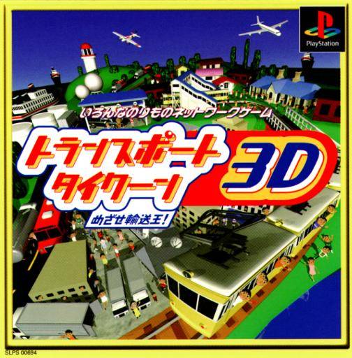
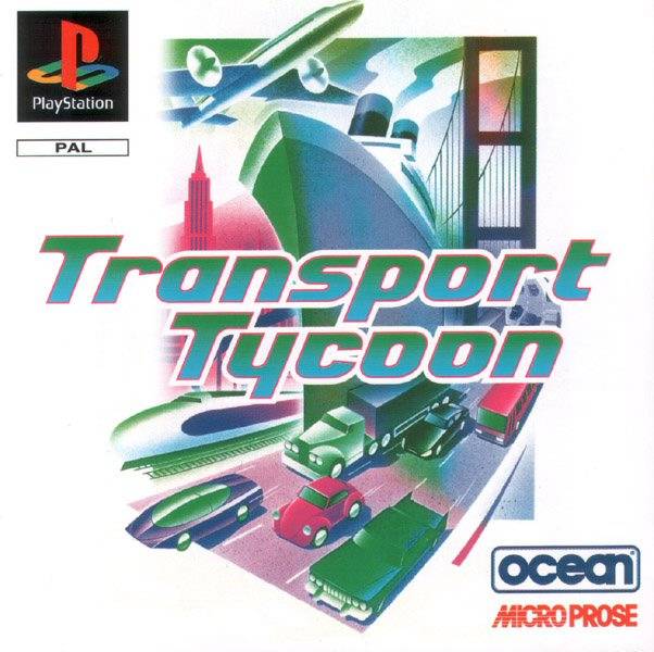
Transport Tycoon 3D on PlayStation. The original game by Unbalance had a pretty cool cover showing the big improvement of the PlayStation port, the 3D engine.

35582_front.jpg


When the game came out in Europe, Ocean decided to not advertise that feature, and instead, they inverted the colors of the PC cover. Probably the worst marketing change I've ever seen.

35831_front.jpg


It never came out in the States.
 
  • Like
Reactions: Alexander1970

Taleweaver

Storywriter
Member
Joined
Dec 23, 2009
Messages
8,689
Trophies
2
Age
43
Location
Belgium
XP
8,088
Country
Belgium
@stranno: Hmm...I've got to admit: if they used a decent color printer for the Europe image, I would say the cover art is a vast improvement over the original (which looks like 'traffic jam the game'). Admitted: I'm absolutely no fan of early 3D models, but even without that taking into account they tried to cram way too much stuff on the original cover.
 
  • Like
Reactions: Alexander1970

Site & Scene News

Popular threads in this forum

General chit-chat
Help Users
    S @ salazarcosplay: @BakerMan can one play cod from hen ps3?