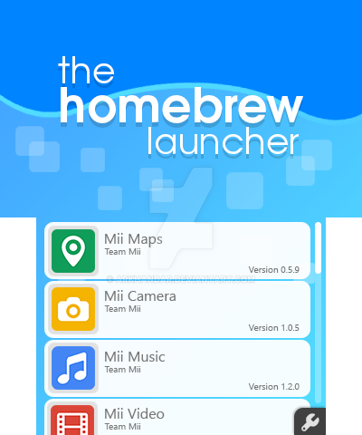
Pretty good but I think the "sky" (upper screen upper part) need to be more clear than water it self?
Maybe a gradiant that make down screen background darker "the more" you scroll?
also I would have called it "Homebrew Launcher" and not "The" cause it seem the want to conquer all? (am I the only one to feel it ?^^)
also a tiny suggestion about app description ^^
Maybe a Release/update date would help to know if that a long time we did not check for updates?
line :
Mii Maps
Team Mii
Version 0.5.9 (DD/MM/YYYY)
or
Version 0.5.9 (MM/DD/YY)
(for sure while keeping your format it just I don't really know how to format text in a forum board ^^)
Else that really pro look , simple and not to much charged of details and flat look like i love