Hacking Skin Feedback

TheStump

Got Wood?
Member
Joined
May 8, 2006
Messages
796
Trophies
0
Age
37
Website
Visit site
XP
241
Country
@Rebellion- great theme, fits well with the style of game. My favourite part is the cheat icons. The complement your theme so well.
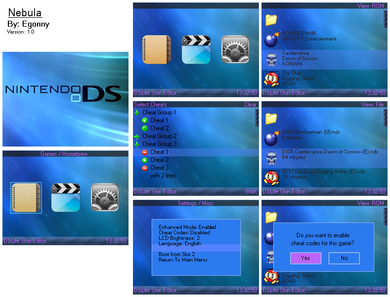
OLD
[3700]screen_shot_collage.PNG
Download

i'm thinking of changing my cheat icons, maybe a more cyan colour. And back the back arrow go down. Wasn't really sure about how the cheat area functioned
frown.gif

My two favs are Killermech's 'Pipboy' and Tweeder's 'doodles'. great work all
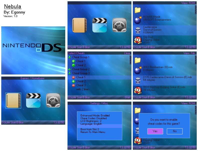

NEW
Fixed cheat icons from last version and added a few extras.
[3709]screen_shot_collage.PNG

DOWNLOAD HERE


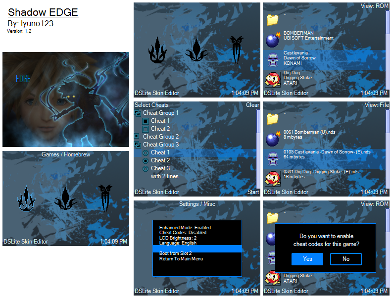
any comments welcome. I can't decide which one works better. any thoughts?
Enjoi.
 

Amici

ex trey, city skull, am I are?
Member
Joined
Aug 5, 2006
Messages
211
Trophies
1
Age
36
Location
Manila
XP
340
Country
Philippines
I dunno how to fix the gradation thing with the left dark sphere
frown.gif
although I was able to work on some new icons for the main menu:

ilemueldg-EDGE_sphere_DocL16_v12.jpg


Download
 

Egonny

Well-Known Member
Member
Joined
Sep 23, 2008
Messages
365
Trophies
0
Location
Brussels, Belgium
XP
172
Country
Belgium
DocL16 said:
I dunno how to fix the gradation thing with the left dark sphere
frown.gif
although I was able to work on some new icons for the main menu:

ilemueldg-EDGE_sphere_DocL16_v12.jpg


Download
Great theme, the icons are very good, but you should make a better scrollbar, this one just doesn't fit in the theme.


Any comments on mine?

screenshotcollagehy6.png


Download it!

And what is it with that 16 bit bmp?
Is it needed that your pictures are 16 bit bmp?
 

Rebellion

Well-Known Member
Member
Joined
Sep 25, 2007
Messages
81
Trophies
1
Website
Visit site
XP
203
Country
Canada
@TheStump - Thanks! Your theme is pretty good too, but I think you should try to make the text on the top more visible. I have no ideas, though, unfortunately...
frown.gif

@Issac - I'll keep that in mind! (I just need the time to do it.
frown.gif
)
 

Amici

ex trey, city skull, am I are?
Member
Joined
Aug 5, 2006
Messages
211
Trophies
1
Age
36
Location
Manila
XP
340
Country
Philippines
@Egonny

I'll fix that now, lol. I'm not very good at color/palette choice. I like the blue in your theme, kinda have a bias towards blue themes
biggrin.gif
My only kinda gripe is the first menu icon for the Games, the color of the Folder icon is kinda off, but otherwise it's great
biggrin.gif
 

TheStump

Got Wood?
Member
Joined
May 8, 2006
Messages
796
Trophies
0
Age
37
Website
Visit site
XP
241
Country
@rebellion. cheers for the comment. I wasn't sure how noticeable it would be. So i've fixed it, better visibility and while i was at it, i added some circuit board effects through the menu.
Feels alot like metriod 3 now.
[3713]screen_shot_collage.PNG
 

Amici

ex trey, city skull, am I are?
Member
Joined
Aug 5, 2006
Messages
211
Trophies
1
Age
36
Location
Manila
XP
340
Country
Philippines
Version 1.3 is up
biggrin.gif
I fixed the colors of the text, windows and scrollbar. Hopefully it looks better now
biggrin.gif


ilemueldg-EDGE_Sphere_DocL16_v13.jpg


DOWNLOAD

EDIT: Fixed scrollbar
smile.gif
 

Zamo

Well-Known Member
Member
Joined
Oct 10, 2007
Messages
156
Trophies
0
Age
34
Location
Cape Town, South Africa
Website
Visit site
XP
269
Country
@DocL16 excellent work, the colours are well matched, but you should do something about the transparency of your scrollbar. The edges are not transparent. Good luck!!

Anyway, here's my entry.
35i3nuf.png

Don't have a DL link yet. Any comments and advice would be much appreciated.
 

Issac

Iᔕᔕᗩᑕ
Supervisor
Joined
Apr 10, 2004
Messages
7,025
Trophies
3
Location
Sweden
XP
7,353
Country
Sweden
Rebellion said:
@TheStump - Thanks! Your theme is pretty good too, but I think you should try to make the text on the top more visible. I have no ideas, though, unfortunately...
frown.gif

@Issac - I'll keep that in mind! (I just need the time to do it.
frown.gif
)

The time needed for that is five seconds
smile.gif
I mean, it's just to say so in the skin editor, on the colors tab
smile.gif
it states some color there for the buttons
smile.gif
yaynds.gif
 

Rebellion

Well-Known Member
Member
Joined
Sep 25, 2007
Messages
81
Trophies
1
Website
Visit site
XP
203
Country
Canada
Anyways, updated my theme a little.
screenshotcollagene1.png

CHANGELOG:
- changed "SELECT YOUR OPTION" into "SELECT YOUR CHOICE" to avoid confusion with the options icon.
- added green bars to make text clearer (really difficult decision for me. please comment on this decision! i'd really like to hear something about this.
- recoloured blue cheat icons into green cheat icons.
- changed scroll bar into green and purple moldorms.
Download!

@TheStump: Your grey text is a little difficult to see.. Try white! o_o
 

Amici

ex trey, city skull, am I are?
Member
Joined
Aug 5, 2006
Messages
211
Trophies
1
Age
36
Location
Manila
XP
340
Country
Philippines
@Zamo

Yeah I noticed it too, fixed it already
smile.gif


I like your theme, but I think the all-black background needs more flair. It looks a bit empty.. But your icons are already very good
smile.gif
 

Raestloz

GBATemp's Lone Wolf
Member
Joined
Feb 7, 2008
Messages
1,775
Trophies
0
Age
33
Location
The World of Illusion
XP
308
Country
Indonesia
@Oneofthesame: The first thing I noticed is you forgot this is EDGE, not R4.

1st icon is Games, okay I think we can get away with that
2nd icon: MCTR? It's Multimedia/Media/Moonshell, unless MCTR is Multimedia/Media/Moonshell in other languange, I advise you to change it
3rd: A fatal failure, since it's Settings, not BOOT slot-2 like R4

Other comments? No, nothing for now, I can see that it's finished, the text seems visible enough for me and the color choice are all in harmony

EDIT: @Egonny
Sorry for not replying a.s.a.p.

This is what I'm talkin about
screenshotcollagerj1.png


screenshotcollagerj1-1.jpg


the top image is in PNG format, while the bottom is in 16 bit bmp format (well, .jpg, since photobucket converted it, but the color is still 16 bit)

as you can see, 16 bit color is not as rich as 24 bit or worse, 32 bit color, as the result, gradations won't be displayed correctly, as it lacks the appropriate color for it, what happens is instead of smooth gradation, you'll see blatant color change in wave like shape

what matters is it happens with your bottom image, which is not good, although the text might distract us from it

if you have an EDGE, try it there, whether is actually looks good or not IDK, since I never actually test it, but from my own experience (I have encountered the same problem too with my skin, as the result, I removed the glow from the wavy lines) that is waht your pic will look like on an EDGE
 

Zamo

Well-Known Member
Member
Joined
Oct 10, 2007
Messages
156
Trophies
0
Age
34
Location
Cape Town, South Africa
Website
Visit site
XP
269
Country
@OneofTheSame I dont' know if it's just the picture, but I noticed some white dots on the selected text, maybe you could get that fixed. Otherwise I like the simplicity.

Here's my updated Neon:
2n7doj5.png

Again, any help would be much appreciated.
Thanks.
 

rose3694

Member
Newcomer
Joined
Nov 12, 2008
Messages
7
Trophies
0
XP
53
Country
United States
@Zamo - I like it alot very nice looking. (Sorry about not doing this before I am new to forums and I guess a bonehead sigh)

Here is what I submitted. What do you think its the first skin I've ever made. The girl I made her myself, she is designed after this little toy I have sitting on my desk that rocks her head back and forth LOL. Let me know what you think.

Ok so I am very new to this but I know what I like on my DS so maybe other girls do too
smile.gif


DOWNLOAD THEME

screen_shot_collage.jpg


Menu Icons
menu-icons.jpg


Thanks for checking it out.

Rose3694
 

lasharor

Member
Newcomer
Joined
Aug 3, 2006
Messages
13
Trophies
0
XP
74
Country
Netherlands
rose3694 said:
Here is what I submitted. What do you think its the first skin I've ever made. The girl I made her myself, she is designed after this little toy I have sitting on my desk that rocks her head back and forth LOL. Let me know what you think.

Ok so I am very new to this but I know what I like on my DS so maybe other girls do too
smile.gif


DOWNLOAD THEME


Menu Icons


Thanks for checking it out.

Rose3694

@Rose3694 Hmm, I like the fact that you tryed to make somthing original, the first icon is very nice. All other icons kinda are very amaturistic in my opinion.
The background is clean and nice, but I think the scrollbar is ugly...

Let me show my entry...:

screen_shot_collage.jpg


http://members.home.nl/tergezen/skin.zip
 

Site & Scene News

Popular threads in this forum

General chit-chat
Help Users
    K3Nv2 @ K3Nv2: I'm finishing the new god Kong movie pretty decent neighbors even complained twice